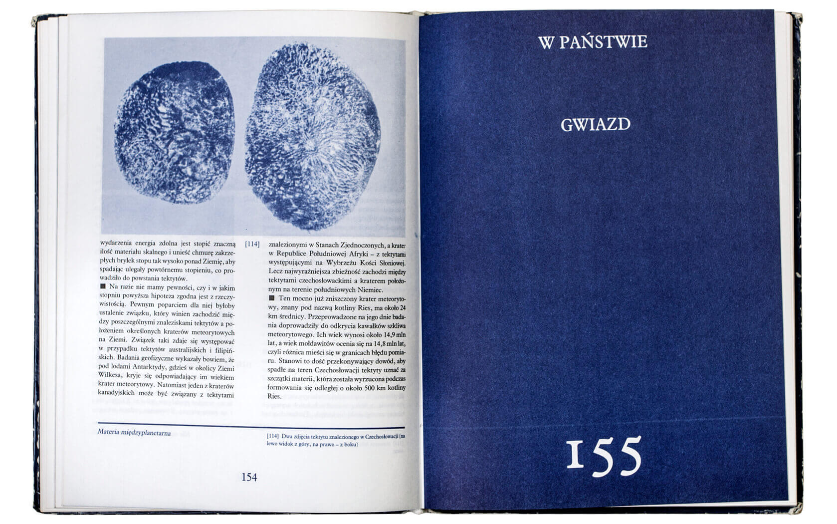
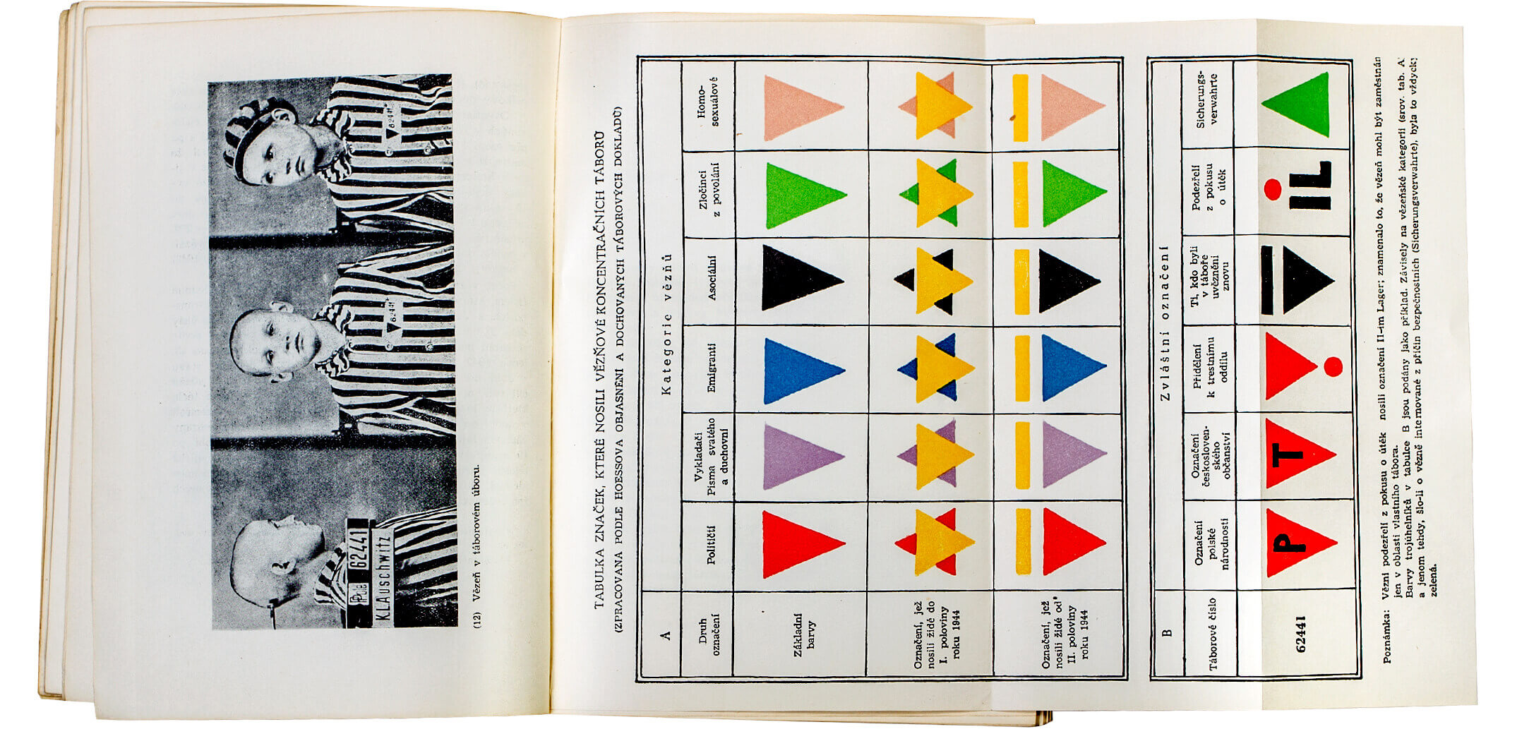
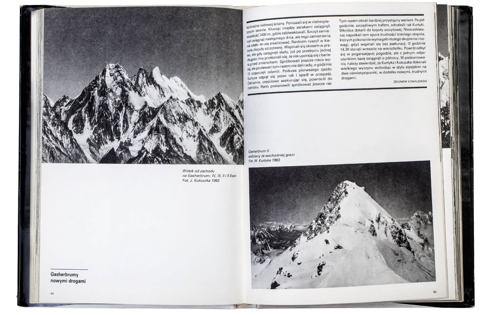
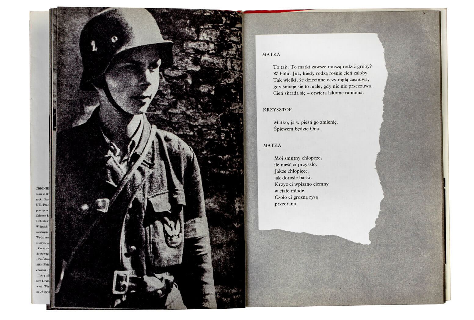
X
Ewa Satalecka
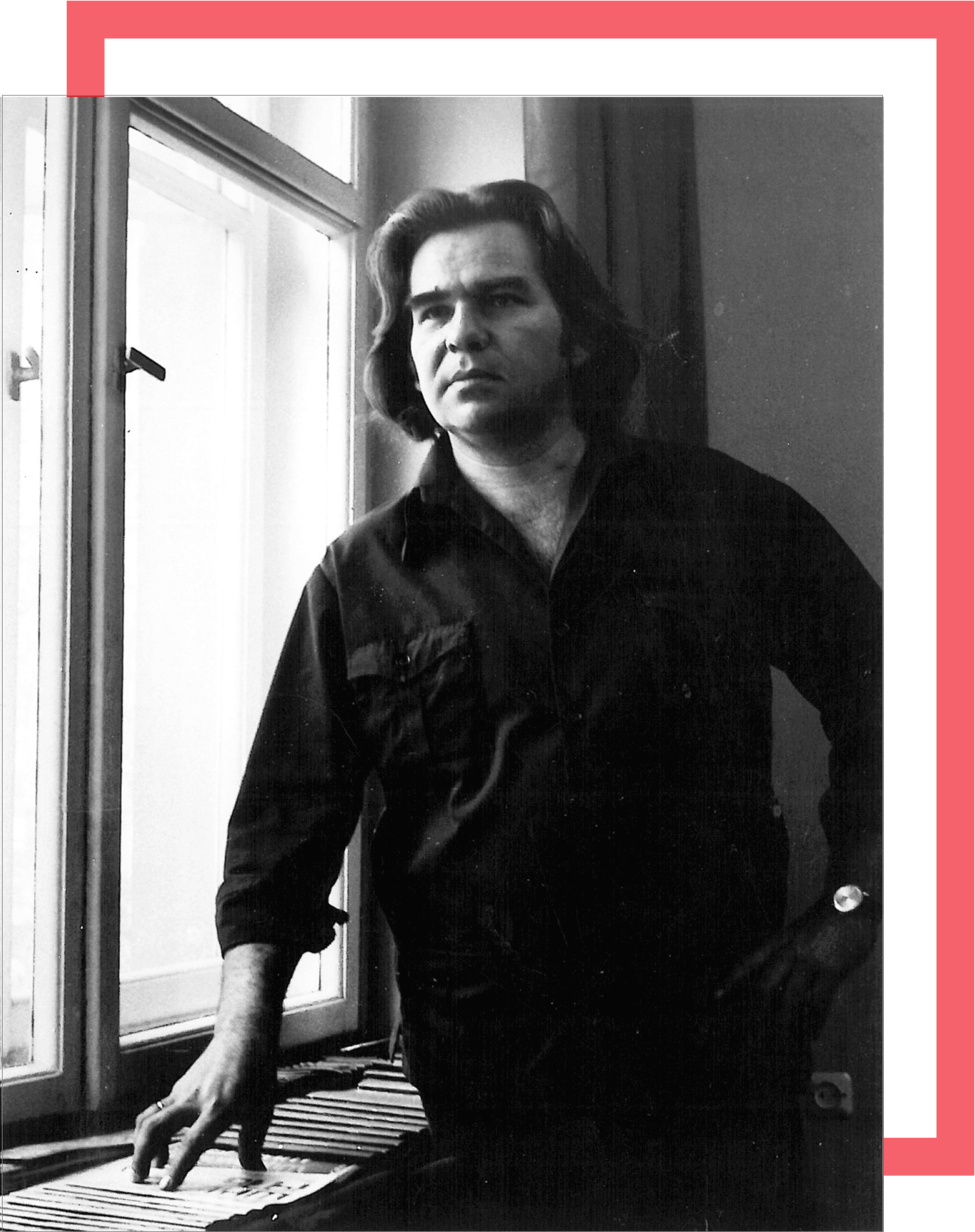
The war had ended and the fires in the devastated capital were dying out. He was eleven years old. The whole world had fallen apart, but he and his mother had survived. Downtown Warsaw, where he was born and raised, had disappeared from the face of the earth following the uprising in 1944. Among the ruins they found a 100 square foot chamber and moved in. Under the bed, in a cardboard box, he kept figures that he carved out of rectangular lumps of chalk. A school had to be chosen for him and they needed to return to some normalcy of life. Tadeusz was sent to the State Art Lyceum (today the State Art Schools Complex).
He was not only talented, but also hardworking, consumed by a creative passion. Years later, his friends and wife recalled seeing him in the light of his bedside lamp, hunched over another design. “He was already designing as a student,” recalls his close friend Roman Duszek, “fellow students admired him and were a little jealous, as he had the gift of synthetic thinking, of defining an idea by means of a brilliant visual abbreviation. His logos were distinguished by an ascetic, and at the same time very legible drawing, beautiful, harmonious form and an attractively captured, metaphorical association, accurately defining the object represented.” His signs came into being at the same time as imagination and memory – the moment they were necessitated by the absence of the objects from present perception, to paraphrase Derrida. He was capable of carefully observing and determining verbal-visual associations.
He studied and worked to support his family (he married and became a father at the age of 21), at the same time winning graphic design competitions. In quality, his works from the fifties matched the logos by Paul Rand, Saul Bass and Adrian Frutiger. They are simply beautiful. He designed them at night, curled up on the floor of his cramped room. It was only when their second child was born that they obtained an allocation for a 200 square foot studio apartment.
Work and family life merged into one. Above all, he loved designing, but couldn’t work away from home. He equipped the long awaited cooperative apartment with furnishings of his own design that were simple, raw and geometric, devoid of any decoration. They look like those of Donald Judd from the early nineties, except that they were made 10 years earlier. Pietrzyk’s ability to analyze space and determine the hierarchy of elements of composition is clearly visible in the logo designs he created, his typographic layouts of books and in the shaping of his personal environment. Eliminating everything superfluous and focusing on function, he proposed elegant forms that withstand the test of time.
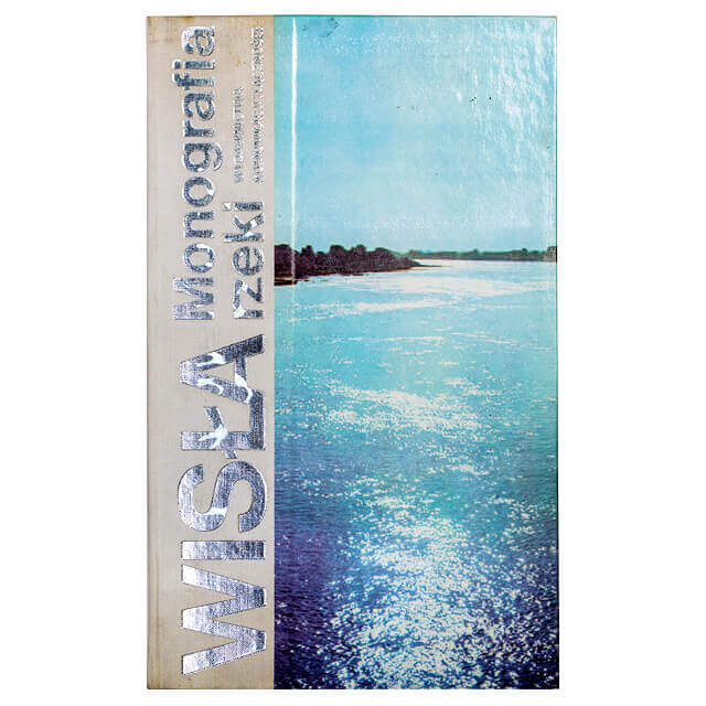
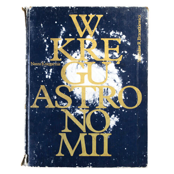
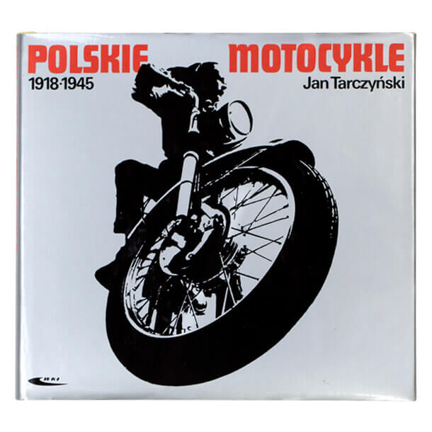
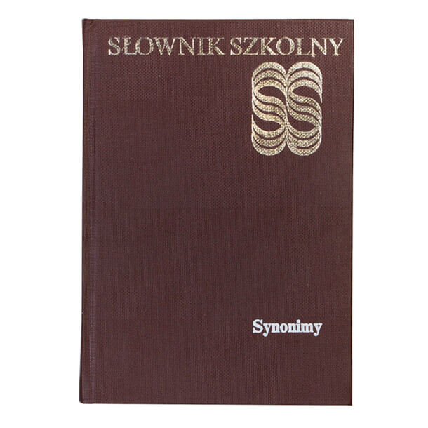
He earned his (Hons.) degree at the Academy of Fine Arts in 1959, but two years earlier was already employed as a graphic artist (in time – as the art director, 1969) at Scientific and Technical Publications (Wydawnictwa Naukowo-Techniczne wnt). There he designed book series and guides, for example the Encyclopedia of Technology (Encyklopedia techniki, 1966) and a Guide to Engineering (Poradnik inżyniera, 1964). In 1969, he took a second job as the art and graphics director (later – head graphic designer) at Transport and Communication Publishers (Wydawnictwa Komunikacji i Łączności wkł), where he worked until his retirement (1998). In addition to logos and book designs – especially popular science and technical titles – he also designed packaging, magazines, posters, practiced printmaking, and even deigned jewelry (for the orno Cooperative).
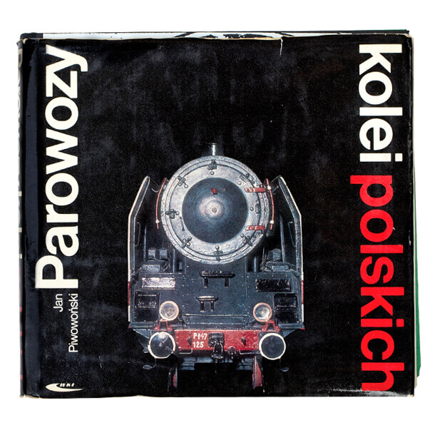
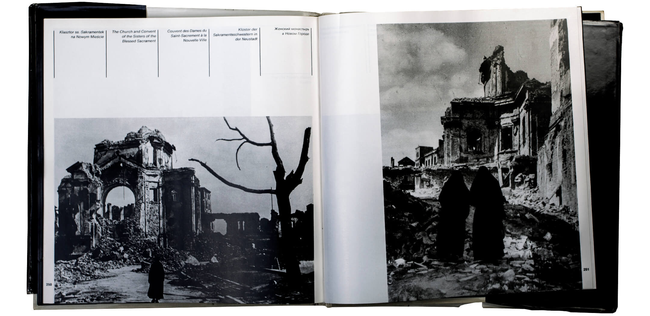
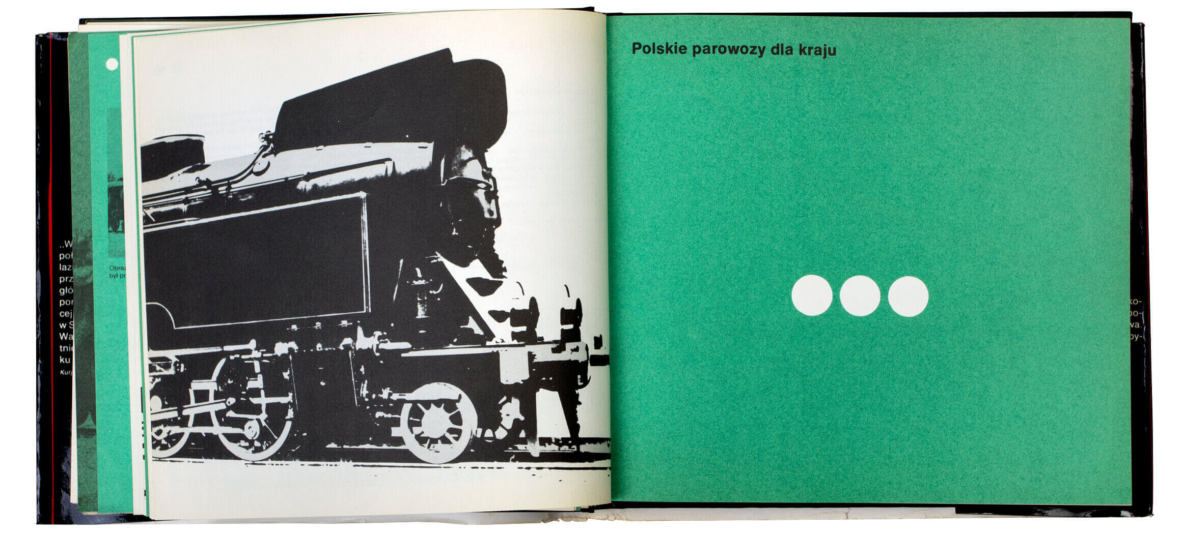
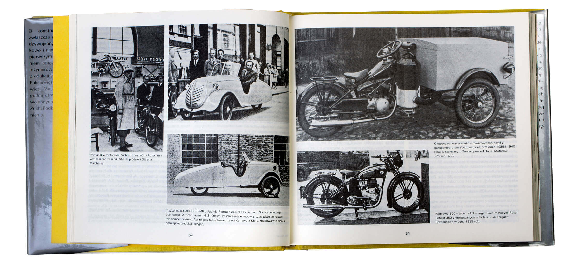
His contemporaries preferred poster designs over encyclopedias, and printmaking over packaging design. “What we were doing,” recalls Roman Duszek years later, “was commonly referred to as hack work.” Prizes for advertising graphics, packaging and book design were “less important,” being “less artistic.” Still, Tadeusz Pietrzyk won quite a lot of them. He was awarded the Golden Chestnut (Złoty Kasztan) for his packaging design for “Froto” floor polish (silk-screen printing on glass bottles, 1964), and regularly received awards for logos (including the Ministry of Light Industry’s Award for the “Telimena” Fashion House logo, 1969). He was considered the creator of the pattern for Polish scientific and technical books. In the years 1960–1999, the Polish Book Publishers Association (Polskie Towarzystwo Wydawców Książek ptwk) repeatedly rewarded publications designed by him – more than 40 awards, including 8 top prizes, such as his Chemistry (Chemia) encyclopedia in 1965 and Polish Steam Locomotives (Parowozy polskie) in 1973. Three of these, with the very inartistic sounding titles: Servos (Serwomechanizmy, 1978), Polish Railway Locomotives (Parowozy kolei polskich, 1979) and Corrosion Fatigue of Metals (Zmęczeniowe niszczenie metali, 1979) also received awards in the competition Internationale Buchkunst-Ausstellung – iba in Leipzig. In his career, Tadeusz Pietrzyk designed more than 200 books for numerous Polish publishing houses. He created the canon for Polish popular science books and modern layouts for encyclopedic publications. His functional typography is, as Beatrice Warde would say, like “crystal-clear glass, thin as a bubble, and as transparent.” The tasteful detail of these simple and easy to navigate books is captivating: with gracefully composed endpapers and fine colors that serve as an information code and break the monotony of gray pages. Wojciech Pawlak wrote in the magazine Technical Press (Prasa Techniczna): “Cool elegance – is the best description of the books in the series Electronics and Telecommunications Problems (Problemy elektroniki i telekomunikacji). [...] In assessing the means of differentiation used by the artist: colors and fonts, I strongly approve of color! It is decidedly Tadeusz Pietrzyk’s most graceful partner.” He ended his eulogy with pathos and propaganda: “Thanks to the talent of Tadeusz Pietrzyk, one of the greatest book designers in the entire 35 years of the Polish People’s Republic, people from the world of technology have the opportunity to every day commune with beauty, about which Norwid said ‘it exists to enchant and rouse to work.’”
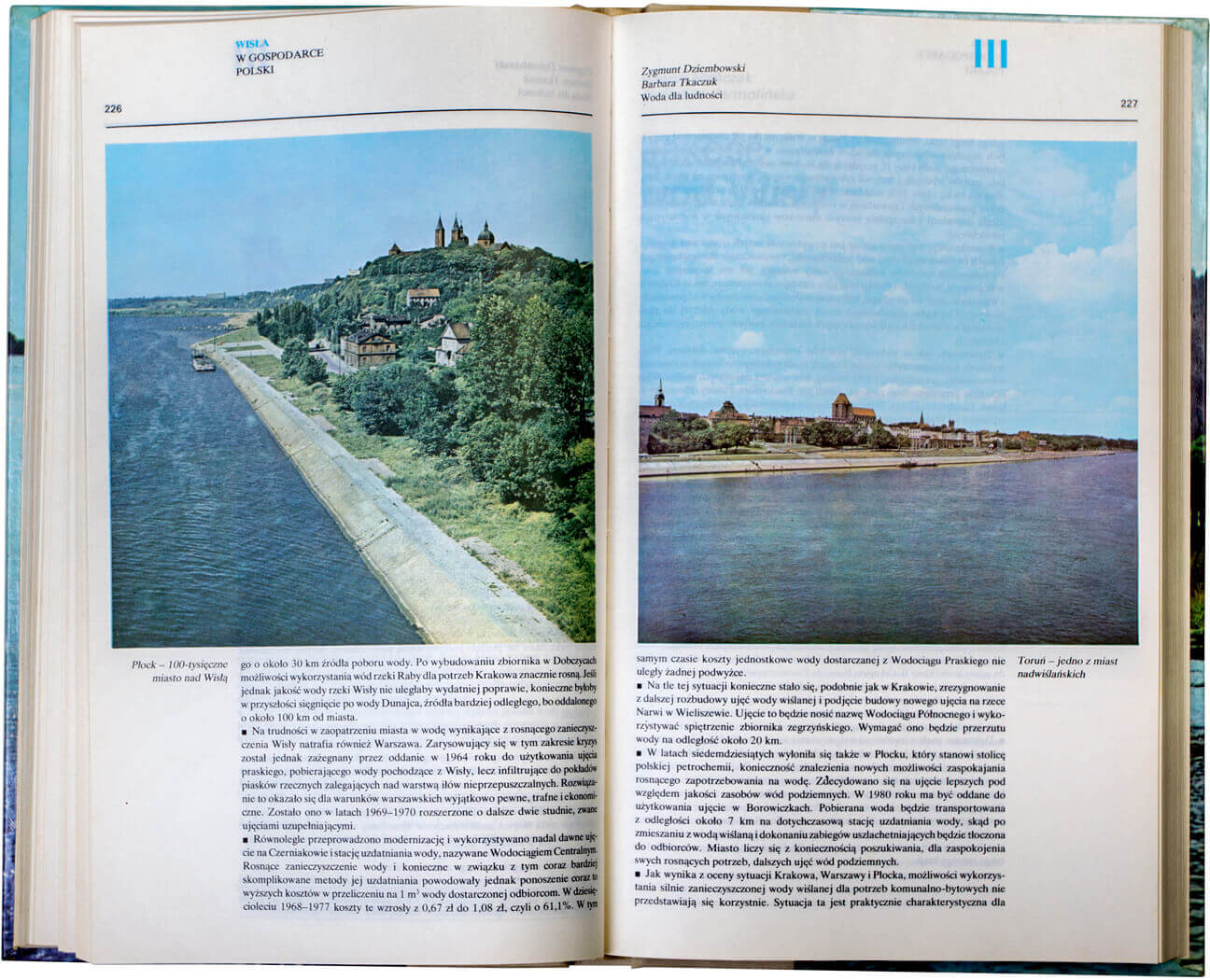
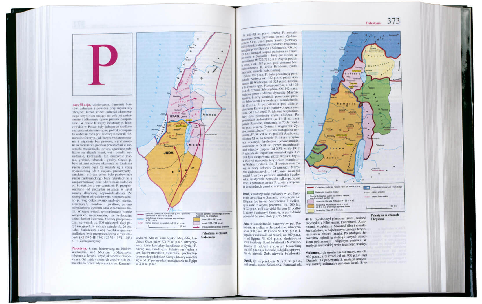
The designer used coarse grade papers in such a way that these would seem deliberately chosen. Serving this purpose was the use of a typeface in many variations and versions and expressive graphic illustration, often black and white, with a single flat color added by means of a woodcut or silkscreen technique. Diagrams, structural drawings and maps are clear, transparent and ideally composed in relation to the space of page spreads. The proportions of white and printed areas were balanced so as to facilitate reading and differentiate complex information.
Roman Duszek remembered seeing the layout of a textbook English Language Grammar (Gramatyka języka angielskiego): “It was the first time I ever held in my hands a textbook that showed the structure of a language.” Pietrzyk was a master at translating content into visual structures. In the journal Nowe Książki (New Books), under the initials T. K., the author of an article in the “Portraits” section wrote: “… but the most important area of Tadeusz Pietrzyk’s work is his book design, which he calls ‘book architecture.’… In his opinion, positive results can only be achieved through close cooperation and partnership between editors, in some cases, even the author, at the time of conceptual work – and the graphic, typographic and technical editors, supervising the implementation of the whole work. ... And so, in books prepared by Pietrzyk we find, for example, captions to illustrations arranged in a manner that prevents their competing with the main text, often relegated to the margin. Nor are his margins accidentally symmetrical, but there to form a text column to ensure maximum legibility, with maximum visibility of distinguishing features. A new solution to facilitate the use of technical books is to introduce chapter numbers alongside pagination and a careful marking of chapters, subsections and other elements making up the book’s layout, so that they not only merge into a single chord with the book’s content, but act as if to ‘prompt’ the reader.” The author goes on to quote Tadeusz Pietrzyk’s motto: “To so design both the graphics and typographic layout of a book that the printer derives satisfaction from its production.”
In the quoted article for the magazine Prasa Techniczna, Wojciech Pawlak recalled: “Everyone who visited a bookstore in October 1979 and stopped in the fiction section could not help noticing the five-volume edition of Selected Works by Leo Tolstoy, with which the National Publishing Institute (Państwowy Instytut Wydawniczy piw) inaugurated its Library of Classics (Biblioteka Klasyków). From among the mass of books, the sharp eyes of customers quickly discerned these volumes of enchanting beauty: graceful 16-page signature, printed on good third grade offset paper, presented in a fine, golden dust jacket designed by Tadeusz Pietrzyk.”
Tadeusz Pietrzyk’s life and work can be summed up by another quote from Beatrice Warde: “Nobody (save the other craftsmen) will appreciate half your skill. But you may spend endless years of happy experiment in devising that crystalline goblet which is worthy to hold the vintage of the human mind.”
Polish-Japanese Academy of Information Technologies
supported in this endeavour by Adam Mickiewicz Institute/culture.pl, wihes to thank for permission to reprint the article written by Ewa Satalecka “Tadeusz Pietrzyk”, first published in VeryGraphic: Polish Designers of the 20th Century, edited by Jacek Mrowczyk.
 Tadeusz Pietrzyk was born in 1933 in Warsaw. He died in the same city in 1999. He graduated from the Warsaw Academy of Fine Arts (with an honors degree from Prof. Andrzej Rudziński’s studio) in 1959. From 1957, he worked as a graphic designer and (from 1969) as the art director at Scientific and Technical Publications (Wydawnictwa Naukowo-Techniczne wnt). In 1969, he was also made the chief graphic designer at Transport and Communication Publishers (Wydawnictwa Komunikacji i Łączności wkł). In addition, he collaborated with many other national publishers, designing mainly popular science and technical books, encyclopedias and albums. For his editorial work and trademark designs, he received numerous awards and distinctions, including two special prizes from the Polish Book Publishers Association (Polskie Towarzystwo Wydawców Książek ptwk) “for services to graphic arts and the typographic development of books” (1971) and “for the creation of Polish scientific and technical books” (1980). His work was exhibited and awarded at the Internationale Buchkunst-Ausstellung – iba in Leipzig. He was also awarded by ptwk for his overall achievements in book design, technical book design in particular. He was decorated “for services to culture”, received the Golden distinction of Association of Polish Artists and Designers zpap, and Golden Cross of Merit.